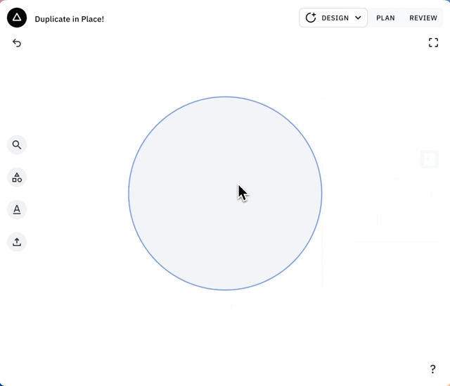
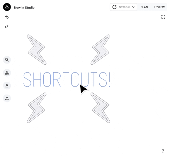
Draw
The flexibility of familiar pen tools, with thoughtfully approachable CAD functionality
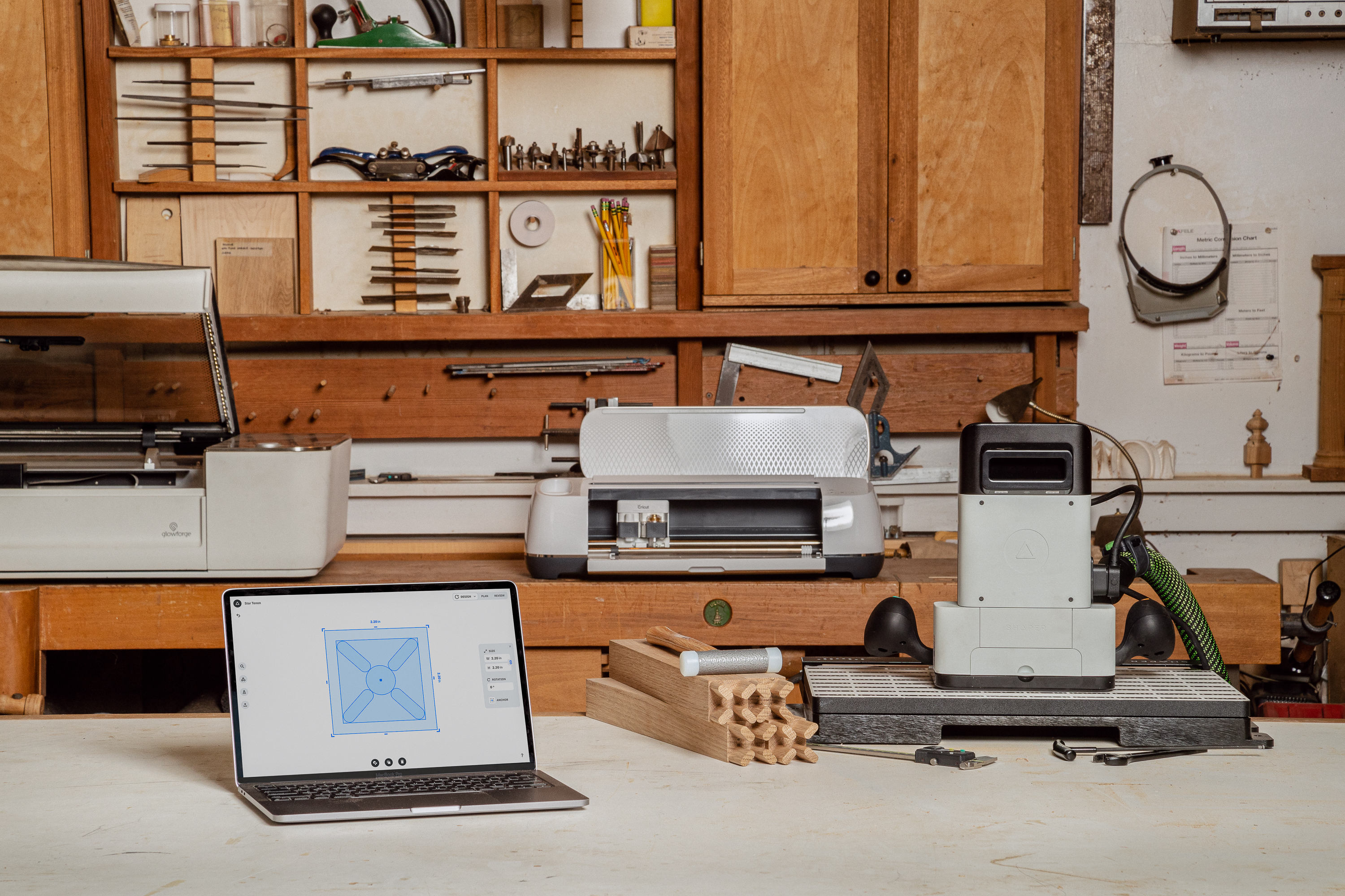
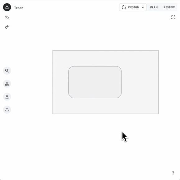
Since its launch, Studio had been in dire need of a feature that could enable users to draw custom lines and shapes. Pen tools are a very familiar solution, but they typically lack the control you need in the world of fabrication and craftsmanship, where you are designing and building something to spec. Either it needs to fit into a specific slot, or maybe it needs to have cut outs for a specific piece of hardware. With our users it mind, it was clear we couldn’t design a normal ‘pen’ tool.
Example
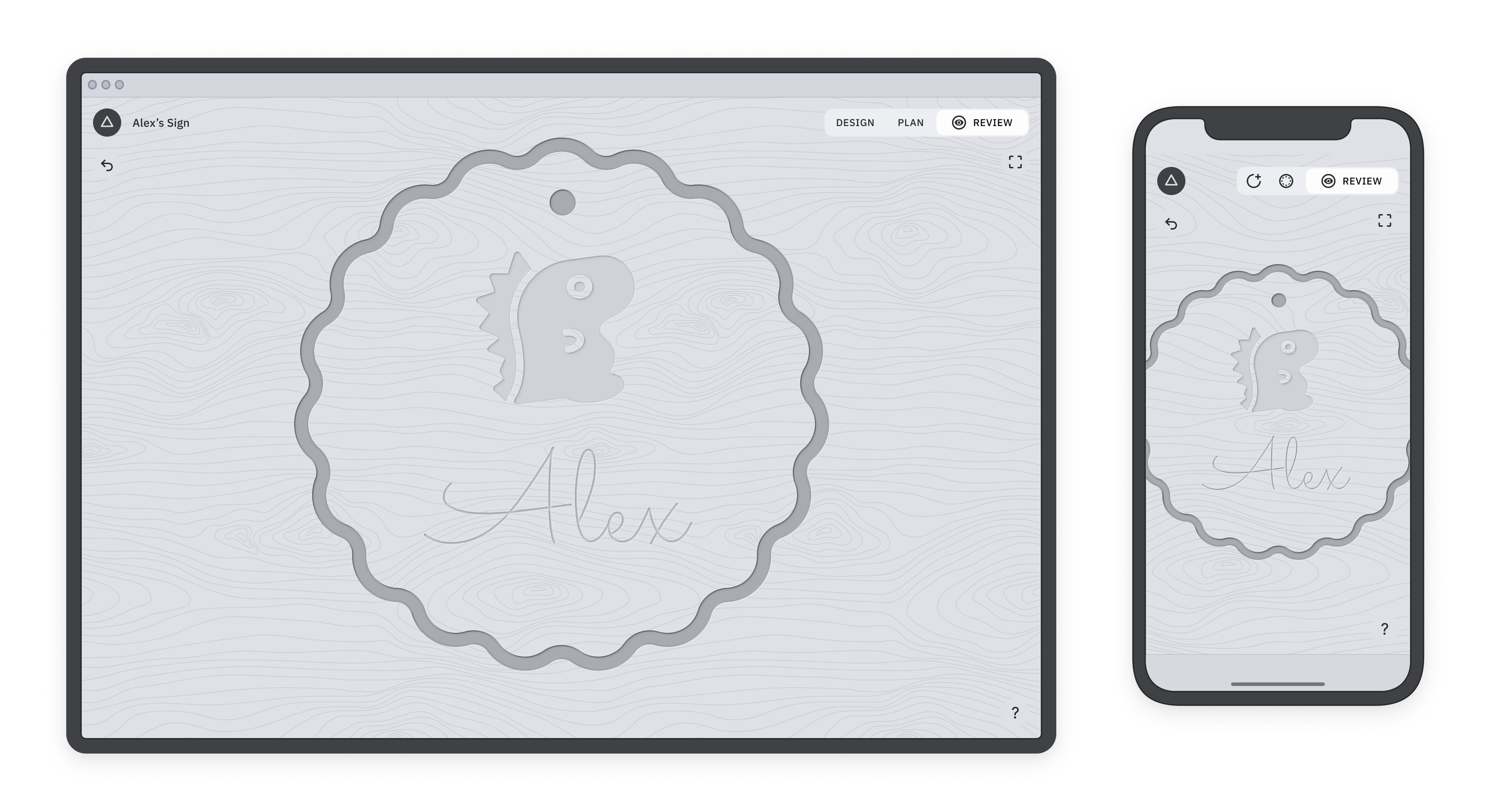
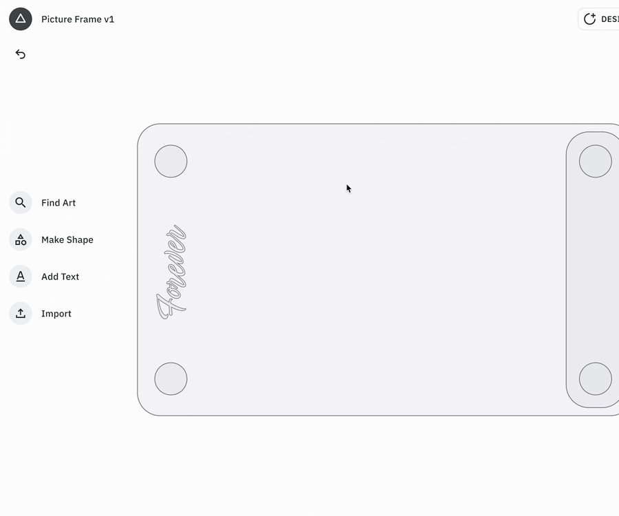
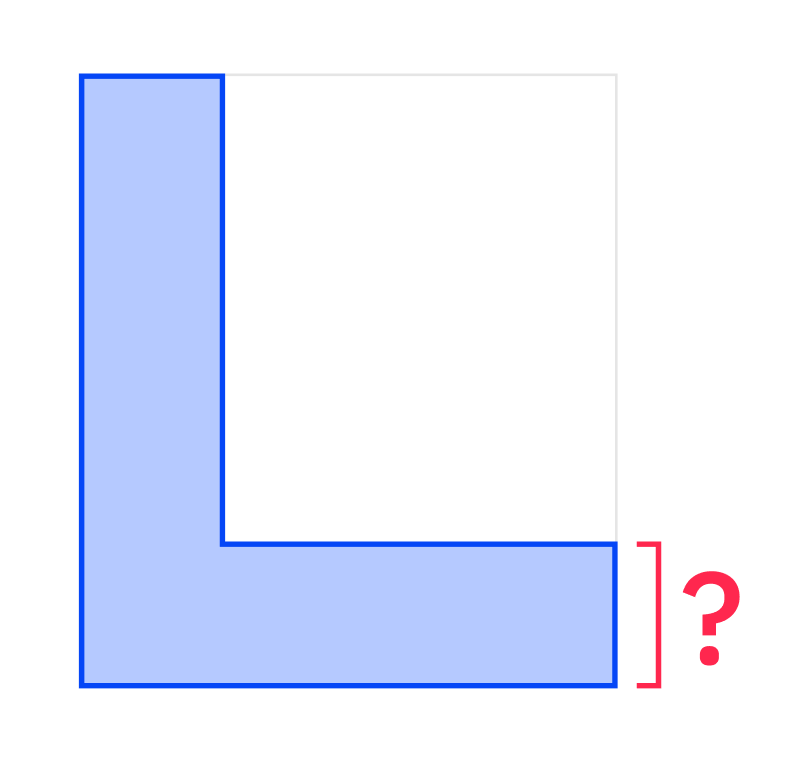
How would you draw a shape like an L-bracket with a precise length on the ends? If you use a typical vector pen tool, you will find that while drawing a rough shape is easy, there is no control over the lengths of your individual segments, only for the overall size of your shape.
You might turn to making ‘construction shapes’ that you can reference while drawing or maybe combine, but then editing your lengths after the fact will be a chore. Or, you can turn to a more powerful CAD program like solidworks, where you can set dimension of pretty much anything, but you’ll have to dig through a mountain of menus and features you don’t need.
Our ‘pen’ tool needed to be both
controllable and
approachable to meet the needs of our not-so-computer-savvy but precision-minded users.
Prototyping
Because of the dynamic and interactive nature of a feature like draw, it was difficult to get valuable feedback from Figma prototypes so, initially, I tried leaning on our engineers to build prototypes to test with users. The prototypes were higher fidelity than needed, and because the ideas were rough the execution was often not quite what I wanted. I was wasting their precious time!
So, I decided to make my own prototypes.
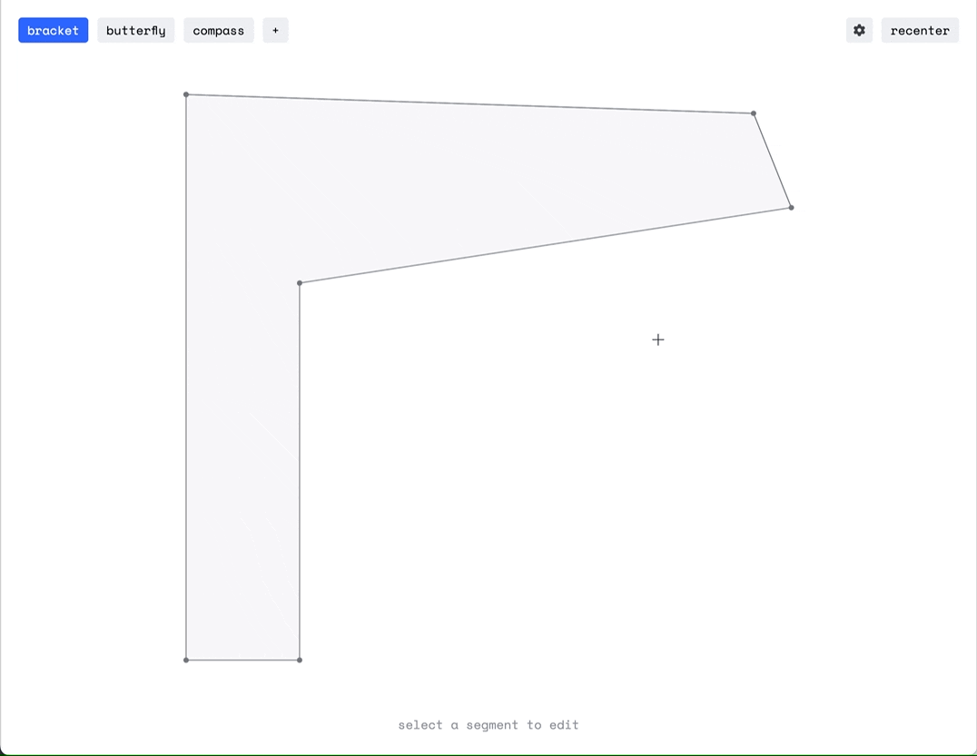
I created several prototypes in paperjs to test behaviors and interactions for creating and editing polyline shapes.
The first prototype allowed users to try adjusting polygon shapes while applying different behaviors and styling, to understand what feels most intuitive while segment editing:
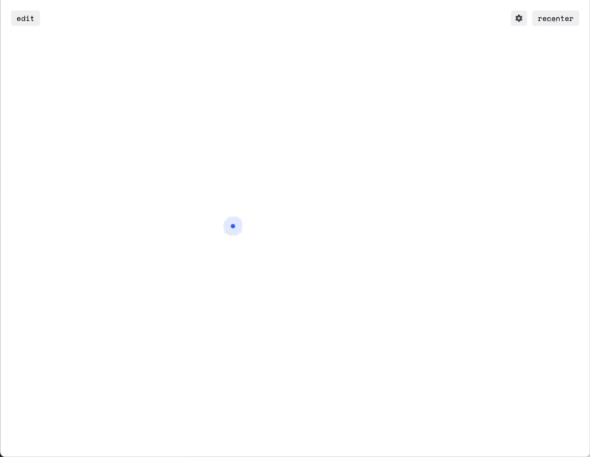
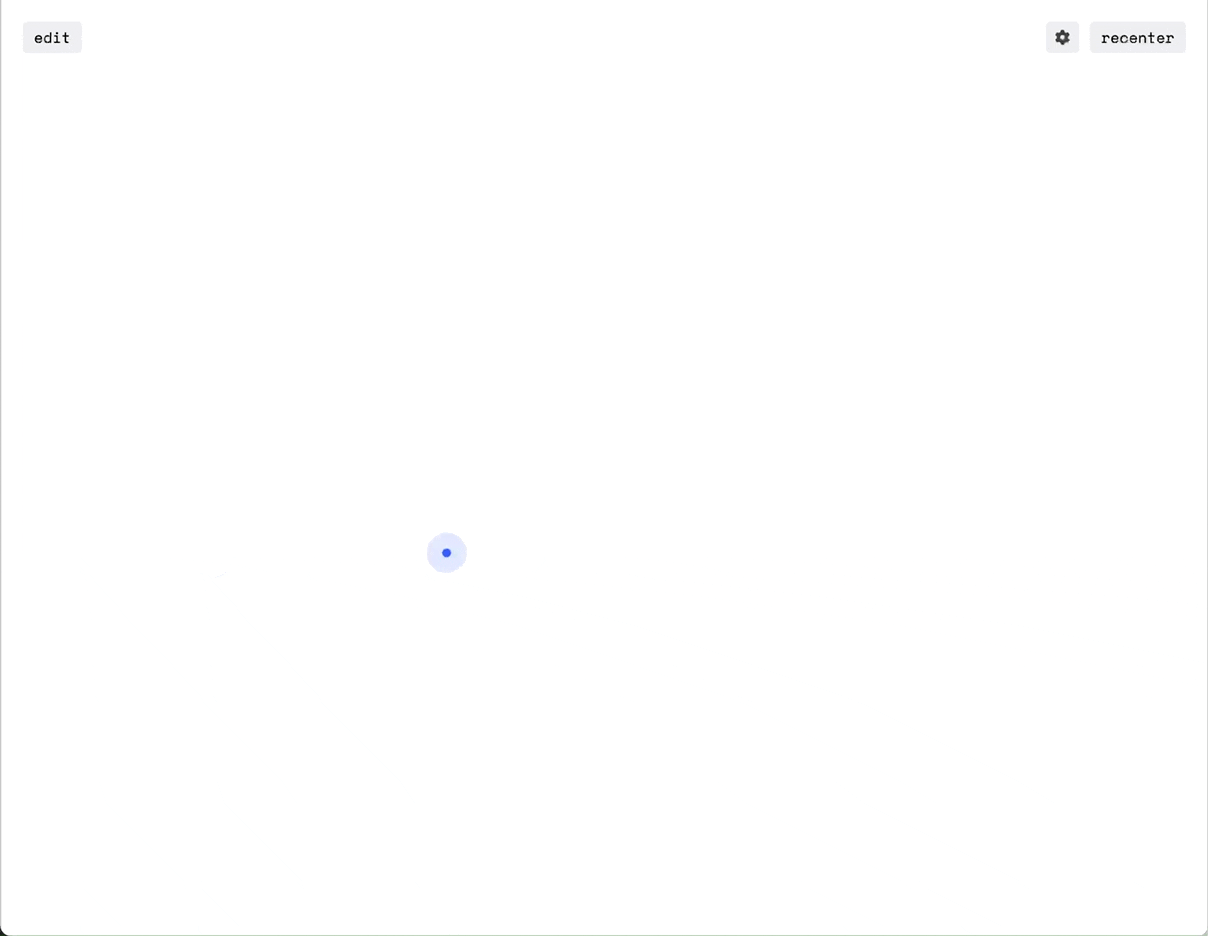
Another prototype explored styling and behaviors for
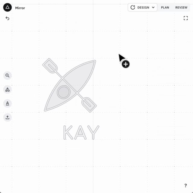
creating polyline shapes. I implemented features to snap not just to previous points but also to previously used dimensions, for snappy drawing of repeating forms, like finger joints. I also implemented features to allow user to type dimensions while drawing:
Prototype Learnings
- It is extremely important to visually communicate what parts of the polyline will move when edits are made.
- Angles are confusing to most users, especially when they are larger than 90°. It was important to visually display the angle being referenced in the parameter panel.
- An ideal version of a polyline tool should allow the user to lock set lengths, either manually, or implicitly when a length is typed in. This was however out of scope for the first version of this feature.
Spec-Work & Sweating Details
There was a rather large figma file to help spec the many intricate behaviors and styles for Draw, and while I can’t share the whole thing here, there’s a few parts I’d like to call out as they help show how I like to communicate information visually.
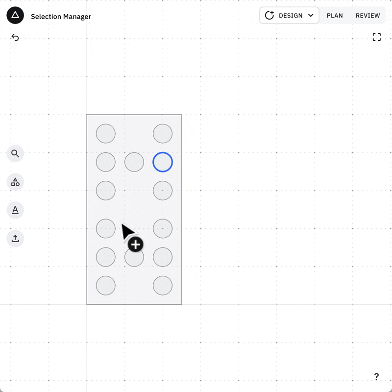
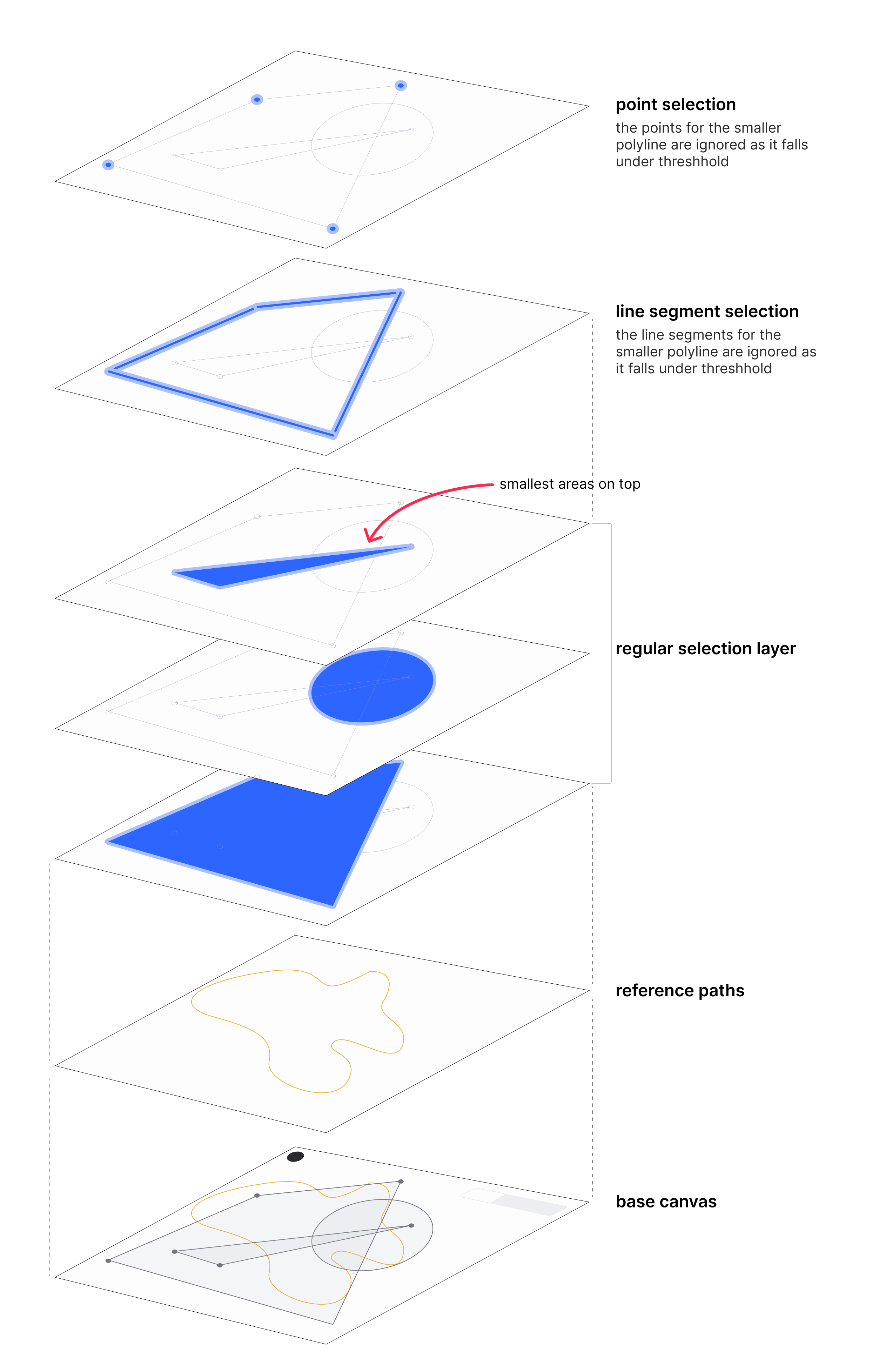
A lot of thought and attention to detail went into creating selection rules for polyline shapes so that the shapes and their parts could be intuitively interacted with. I quickly created this diagram to communicate overall selection order of shapes, segments, and points to engineers:
![]()
This order means that a user can easily select small shapes or small parts of shapes like points, just by moving their cursor over it. The detail didn’t end there though!
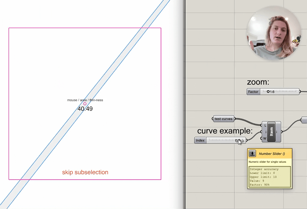
If a user is zoomed-out enough that their shape is very small, the higher-priority touch targets for points would overwhelm their ability to select an entire shape, which they are more likely to want at that zoom level. So, we needed to set up rules to ignore those touch targets depending on zoom level - but also depending on the size of the shape. I created a quick grasshopper definition to help me find a logical test for this exception, for a variety of different shapes and testing different zoom levels.
here’s a little sped-up snippet of the video I made to include in the ticket explaining desired behavior:
![]()