Super Graphics
The Class Theme:
Every year, the capstone product design class at MIT presents a new theme, meant to inspire students as they brainstorm ideas for new products. In 2017, the theme was:
SUPER!
I created graphics along this theme, to be used throughout the class. An important factor in this project is that the class is always divided into 8 teams, each represented by a unique color:
Red, Orange, Yellow, Green, Blue, Purple, Pink, and Silver.
My first step was to do some research on superheroes and superpowers. I put together this association chart to help the staff and students define "super" and to encourage diversity in their brainstorming:

Visual Theme & “Product Man”:
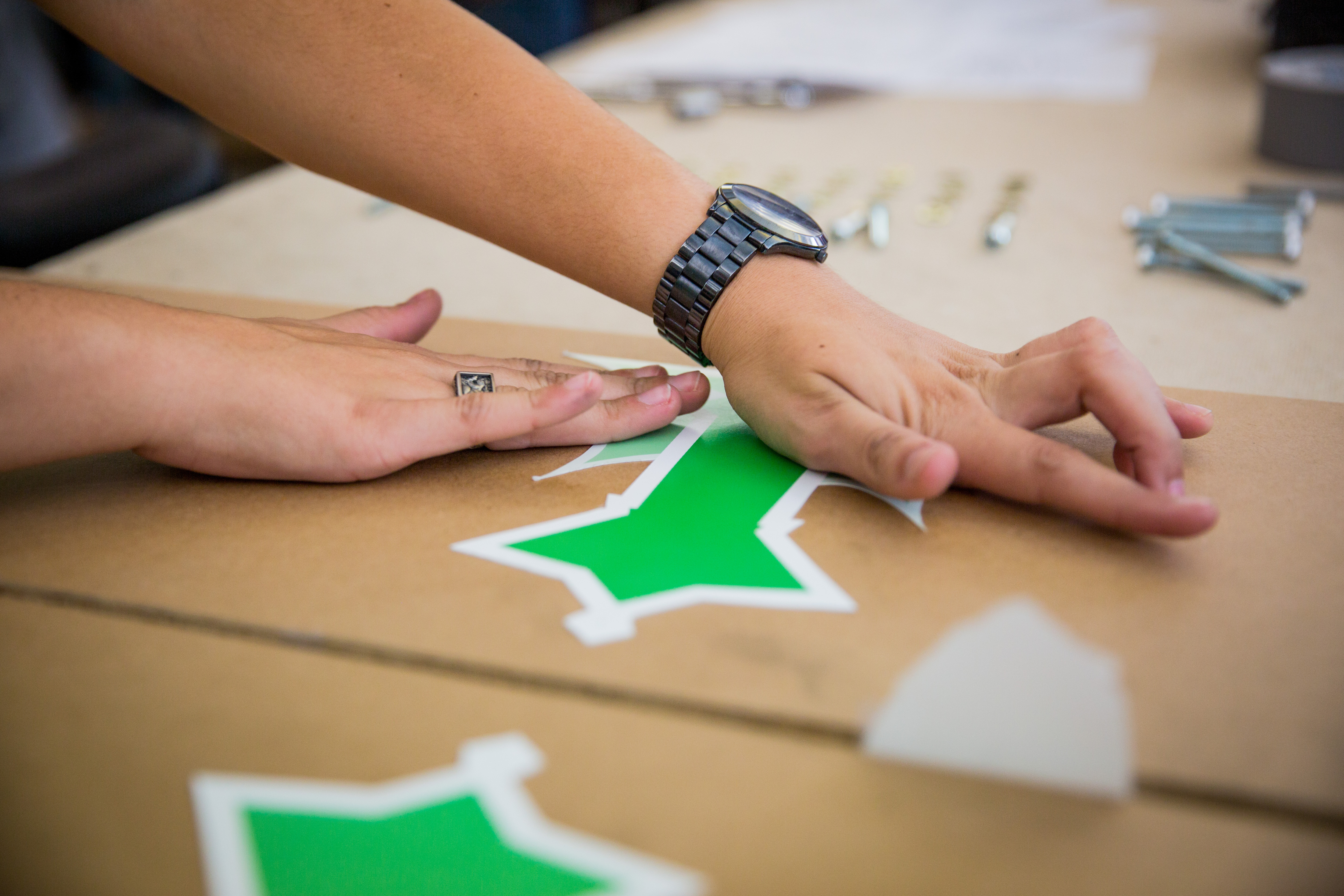
I decided to embody the "super" theme for teams by assigning each team a shape, which could later be represented as shields with emblems:

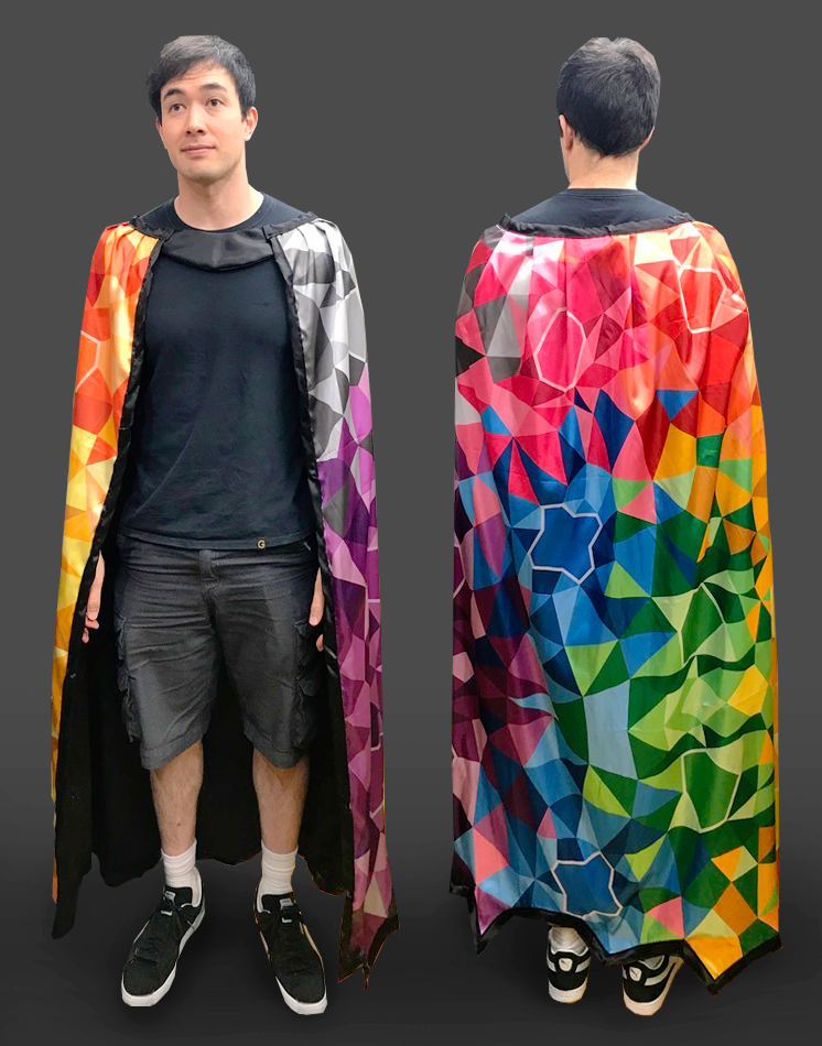
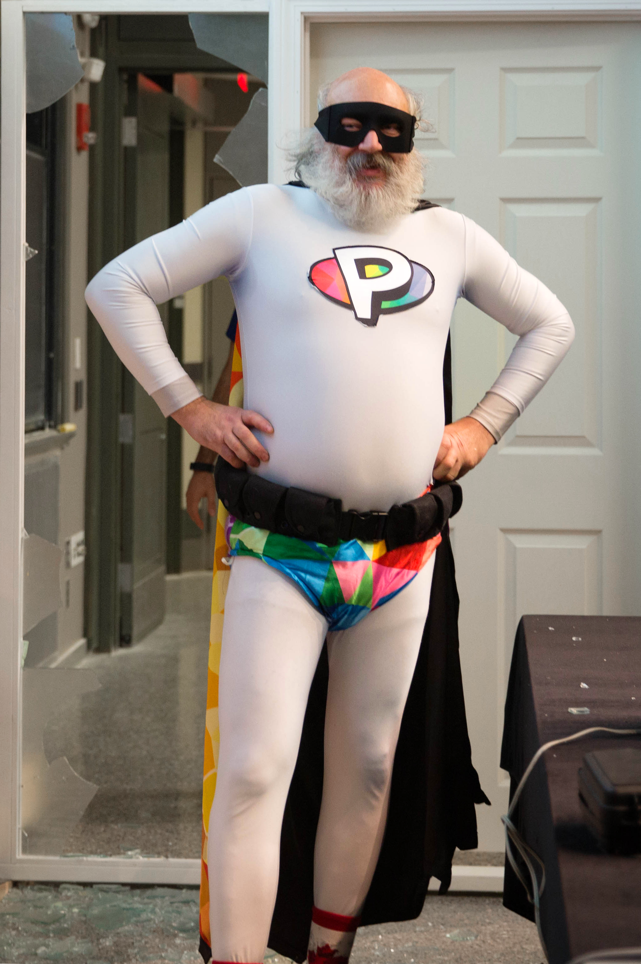
The mosaic containing these shields was also used as a cape for our new super-hero character "Product Man" (aka, Professor David Wallace). Here is James modeling the cape when it was first sewn (by talented co-TA Georgia Van De Zande):
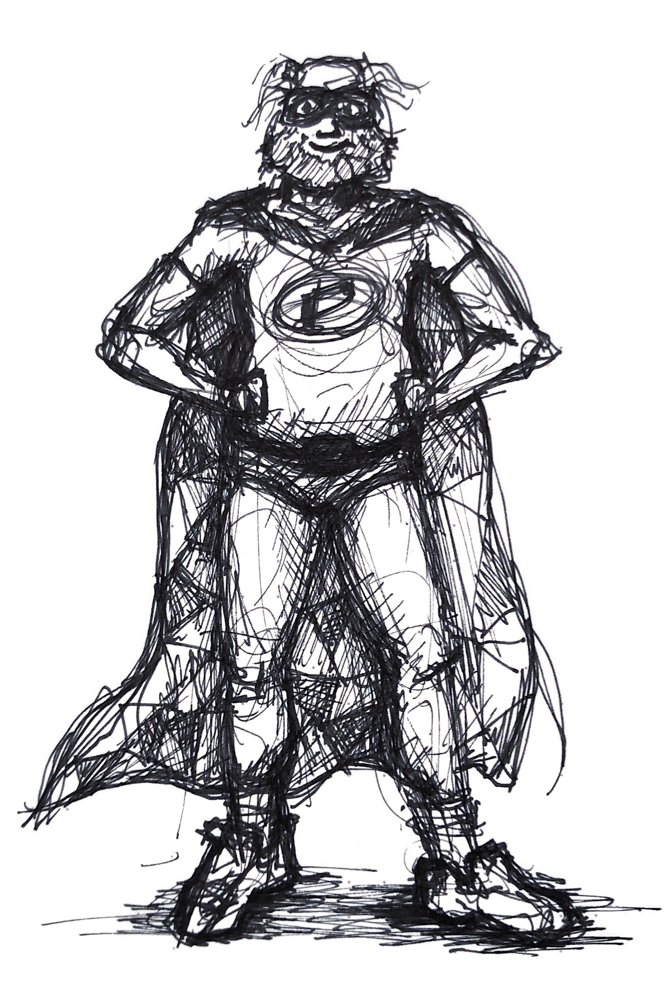
My sketch of Product Man:
![]()
The real Product Man:![]()
Sub-Theme Emblems:
Several weeks into the semester, teams are assigned a subtheme based on the team's most promising proposed product ideas. In order to give teams as much time as possible to work with their sub-themes, the staff only have a few hours to decide on subthemes and create graphics for them.
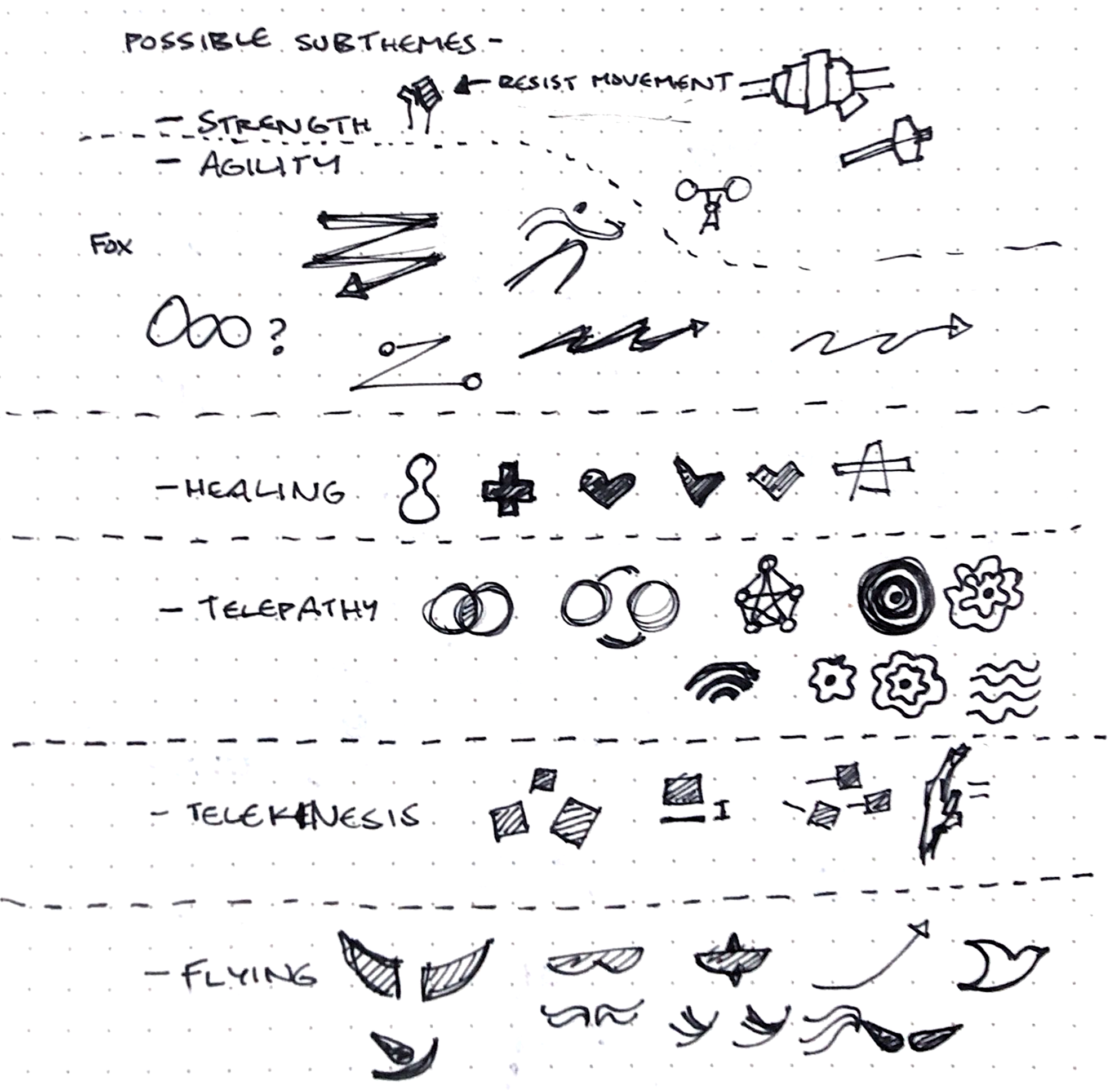
I had started brainstorming potential subthemes and icons ahead of time and had some doodles ready in my notebook:
Later, I recorded my screen during this design session, so you can see how I went about making 7* new emblems in ~2.5 hours at ~50x speed:
*the 8th team emblem (for pink team) was designed by another talented artist, Chuck Xia.
The finished emblem designs and their associated superpowers:
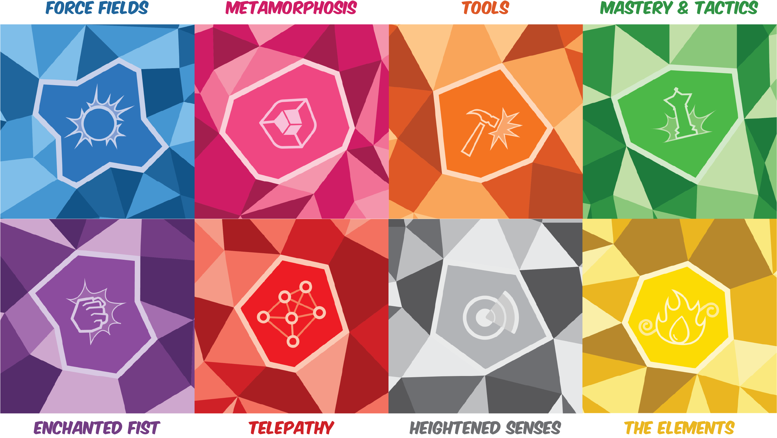
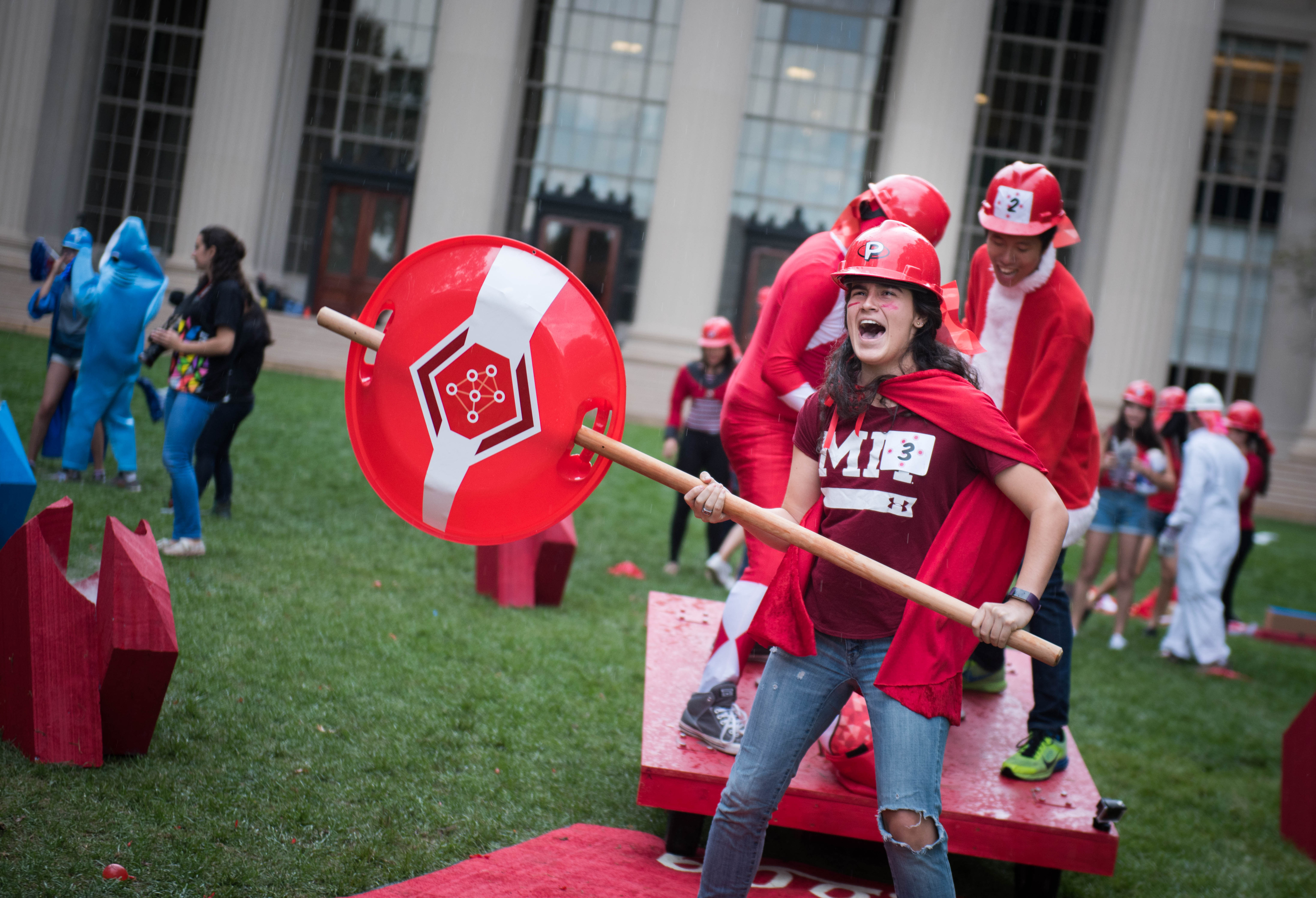
The emblems would later be used on real shields by teams during the famed "build challenge," an obstacle-course like competition event that provides team-building and stress relief from recent design critiques:
